Whole document tree
| GNOME 1.4 User's Guide | ||
|---|---|---|
| <<< Previous | GNOME Applets | Next >>> |
Utility Applets
Character Picker Applet
Character Picker applet, shown in Figure 56, allows you to easily write many characters which are not available on standard keyboards such as accented characters, certain mathemathical symbols and punctuation, and some other special symbols. To add this applet to a Panel, right-click on the Panel and choose Panel->Add to panel->Applet->Utility->Character Picker.

Usage
First, bring the cursor focus to the Character Picker applet by left-clicking on one of the characters displayed in the applet. Specify the character group by pressing the corresponding key on your keyboard. (For a complete list of the character groups and corresponding keys, see the section called Characters.) For example, to see the various accented versions of the "a" letter, press "a". After you have found the correct letter or symbol, left-click on it to copy the symbol into the buffer. The character should appear as a depressed button. This is similar to the common Copy command available in many programs. To paste the symbol in any window, just click in the window with the middle mouse button. Most applications which have Copy and Paste features will also allow you to paste the symbol using its Paste command.
 | ISO-8859-1 (Latin-1) character support |
|---|---|
Note that some applications do not support ISO-8859-1 characters. These applications will not display some characters from the Character Picker applet. |
| Cut and Paste in X |
|---|---|
The X Windows system allows you to copy and paste text by highlighting it with the first mouse button to copy the text and then pasting the text by pressing the middle mouse button. Note that Character Picker uses the same copy buffer as X uses. Thus, when you select a character in the Character Picker it replaces any previous text in the buffer from highlighting text. Similarly, if you have selected a character in Character Picker and then highlight text, the highlighted text will replace the character in the buffer and the character's button will no longer appear depressed. |
Right-clicking on the applet brings up a menu containing the following items:
Properties… — opens the Properties dialog.
Help — displays this document.
About… — shows basic information about Character Picker Applet, inluding the applet's version and the author's name.
Customization
You can customize Character Picker applet by right-clicking on it and choosing Properties…. This will open the Properties dialog(shown in Figure 57), which allows you to change various settings.
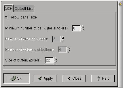
The properties in the Size tab are:
Follow panel size — If this button is checked, the Character Picker applet will automatically set the appropriate number of columns and rows of characters to fit in the Panel.
Minimum number of cells: (for autosize) — This sets the minimum number of character buttons (or "cells") which will be shown. The actual number of character buttons may exceed this number, depending upon the Panel size and number chosen. Note that if this number is too small, some characters may not be visible. (This variable does not influence the cell layout if the Follow panel size button is not selected.)
Number of rows of buttons: — This determines the number of rows of character buttons (or "cells") that appear in the applet. (This variable does not influence the cell layout if the Follow panel size button is selected.)
Number of columns of buttons: — This determines the number of columns of character buttons (or "cells") that appear in the applet. (This variable does not influence the cell layout if the Follow panel size button is selected.)
Size of button: (pixels) — This is the size (in pixels) of each character button in the applet.
The properties in the Default List tab are:
Default character list — This is the list of characters which will be shown in the applet when you press the space bar. This is a convenient way to keep a list of your most frequently used characters. Just enter your most frequently used characters here.
After you have made all the changes you want, click on OK to apply the changes and close the Properties dialog. Click Apply to apply changes without closing. Close closes Properties without saving changes which have not been applied. Applied changes cannot be cancelled.
Characters
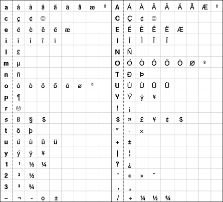
Character Picker applet has all the characters from the ISO-8859-1(Latin 1) character set which are not on standard US keyboards. They are mapped onto the standard characters as shown in Figure 58. The bold characters in the first column of each half and to the left of the dotted lines are the characters you must type in the Character Picker applet to obtain the corresponding characters shown to the right.
Known Bugs and Limitations
This applet has no known bugs.
Authors
Character Picker was written by Alexandre Mu�iz (<munizao@xprt.net>). Please send all comments, suggestions, and bug reports to the GNOME bug tracking database. (Instructions for submitting bug reports can be found on-line. If you are using GNOME 1.1 or later, you can also use Bug Report Tool (bug-buddy), available in the Utilities submenu of Main Menu, for submitting bug reports.
This manual was written by Dan Mueth (<d-mueth@uchicago.edu>). Please send all comments and suggestions regarding this manual to the GNOME Documentation Project by sending an email to <docs@gnome.org>. You can also submit comments online by using the GNOME Documentation Status Table.
Desk Guide Applet
Desk Guide applet, shown in Figure 59, is an applet that allows you to visually navigate your virtual desktops. To add this applet to a Panel, right-click on the panel and choose Applets->Utility->Desk Guide.

Usage
Desk Guide applet helps you navigate all of the virtual desktops available on your system. The X Window system, working in hand with a piece of software called a "window manager", allows you to create more than one virtual desktop to organize your work, with different applications running on each desktop. Each desktop can also be subdivided by the window manager into rows and columns of working space, called "desk areas". Desk Guide applet is a navigational tool to get around the various desktops and desk areas, providing a miniature road map in the GNOME panel showing all your virtual desktops (also known as workspaces) and desk areas, and allowing you to switch easily between them.
Desk Guide applet works hand-in-hand with the window manager, the piece of software such as Sawfish or Enlightenment that handles the look, feel and performance of your windows. The window manager lays down borders, resizes windows, places and moves them. The window manager is in charge of the various desktops. Desk Guide applet handles the navigation.
Desk Guide applet displays miniature versions of all your available desktops, including outlined boxes representing the applications running in each desktop window. The desktop currently in use is highlighted. Mouse-click on a representation of a desktop in Desk Guide applet to switch to display a different virtual desktop on your monitor.
Click and hold with your middle mouse button on any window image in Desk Guide applet to drag the window around your virtual desktops.
| Note |
|---|---|
Different window managers use different jargon to describe virtual desktops and the subdivided workspaces within them. Enlightenment divides your working area into "desktops," and then subdivides those into "screens." Sawfish, formerly known as Sawmill divides your working area into "workspaces" and then subdivides those into columns and rows. Desk Guide applet calls the workspaces "desktops" and the areas within them "viewports". See your window manager's documentation for more informaton on setting up and managing your virtual workspaces. |
Mouse-clicking on the arrow on the left side of Desk Guide applet brings up the Task List window, shown in Figure 60.
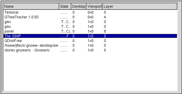
The window lists the various applications running on your computer. Left-clicking on any of the applications listed in the Task List window shifts focus to that application, i.e. this window rises to the foreground and all your keyboard input will be sent to the application running in this window.
Right-Click Pop-Up Menu Items
In addition to the standard menu items (see the section called Standard Pop-Up Items), the right-click pop-up menu has the following item:
Properties... — This menu item opens the Properties dialog (see the section called Properties) which allows you to customize the appearance and behavior of this applet.
Properties
You can configure Desk Guide applet by right-clicking on the applet and choosing the Properties... menu item. This will open the Properties dialog, with four different tabbed pages giving you access to various configuration options - display, tasks geometry, advanced.
Properties - Display
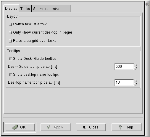
The first Properties window, shown in Figure 61, allows you to control Desk Guide applet's display.
Options include:
Switch tasklist arrow — switches the side of the applet on which the arrow used to launch the tasklist window is displayed.
Only show current desktop in pager — limits the applet display to the desktop currently in use, including all its viewports.
Raise area grid over tasks — If you use multiple viewports (not only multiple desktops) with your window manager, Desk Guide draws a viewport grid in the current desktop. It can either draw the grid on top of the windows or below them.
Show Desk-Guide tooltips — Display tooltips related to various Desk Guide applet components. The arrow is the only widget that displays a tooltip.
Desk-Guide tooltip delay [ms] — delay, in milliseconds, before the tooltip is displayed. You may either type in a number or use the arrows to change the number.
Show desktop name tooltips — Some window managers, such as Enlightenment, allow you to name your desktops. The feature directs Deskguide to show tooltips displaying the desktop's name.
Desktop name tooltip delay [ms] — delay, in milliseconds, before the tooltip is displayed. You may either type in a number or use the arrows to change the number.
Properties - Tasks
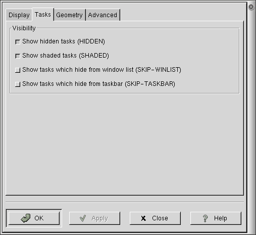
Options include:
Show hidden tasks (HIDDEN), Show shaded tasks (SHADED), Show tasks which hide from window list (SKIP-WINLIST), Show tasks which hide from taskbar (SKIP-TASKBAR) — These four items allow Deskguide to display applications running with flags set that would normally hide them from an application like this. For instance the panel is flagged as HIDDEN, HIDE_FROM_WINLIST and HIDE_FROM_TASKBAR. Selecting these options will allow Deskguide to show such applications.
Properties - Geometry
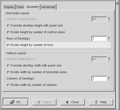
Options include:
Desktop Height [pixels] — sets the height of the desktop. By default this is greyed out, and the panel size automatically sets the desktop height. To activate it uncheck the Override desktop height with panel size checkbox.
Override desktop height with panel size — forces Desk Guide to automatically size itself to the panel. Unchecking this allows you to manually set the height using the Desktop Height setting above.
Divide height by number of vertical areas — divide the total applet height by the number of rows of desktop areas visible.
Rows of desktops — set the number of rows of desktop maps Desk Guide creates in the panel to represent your desktops.
Your window manager, not Desk Guide Applet, controls the number of desktops available on your computer. This feature only controls the way Desk Guide applet displays them.
Divide height by number of rows — forces Desk Guide to fit all the rows of desktops into the height specified above (either one you have manually specified or one set automatically to match the height of the panel). Unchecking this, if you have more than one row, allows Desk Guide to expand vertically to two or more times normal height.
The options for Vertical Layout are mirror those for horizontal layout above, but effect the width instead of height of the applet, and the number of columns it occupies instead of the number of rows.
Properties - Advanced
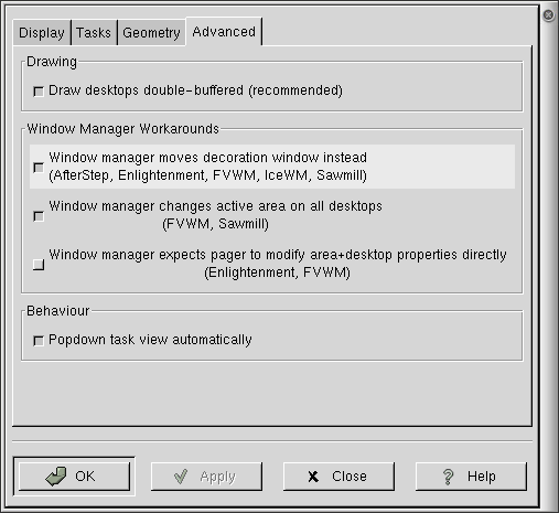
Advanced options allow you to control Desk Guide's behavior with specific window managers, along with other settings.
Draw desktops double-buffered (recommended) — controls the method Desk Guide draws desktops. Without double-buffering, you may see flicker on slower machines. With it, you may see slower performance on network connections.
Window manager moves decoration window instead — Check this if, when you move a window with the middle mouse button, but the resulting window position is off. If in doubt, check this if you use any of the window managers mentioned (AfterStep, Enlightenment, FVWM, IceWM, or Sawmill, now known as Sawfish).
Window manager changes active area on all desktops — If you have more than one desktop, with multiple work areas within each desktop, this option can be used to force the window manager to change the active work area within all the desktops simultaneously if you change your work area on one.
Window manager expects pager to modify area+desktop — Currently has no effect.
Popdown task view automatically — Automatically pops down the task view window after you click on an application in the task view list. If unchecked, you must click a second time on the task view arrow to get the window to pop down.
More Information
All Properties dialogs have the following buttons at the bottom of the dialog:
OK — Pressing OK will activate any changes in the properties you have made and close the Properties dialog.
Apply — Pressing Apply at any time will make your changes active without closing the Properties dialog. This is helpful if you would like to test the effects of the changes you have made but may want to continue changing the properties.
Close — Pressing Close will close the Properties dialog. Only changes in the configuration which were previously applied with the Apply button will persist. Other changes will not be made active.
Help — Pressing Help brings up the manual for the application, opening it to the page describing the Properties dialog.
Standard Pop-Up Items
All applets should have the following items in their right-click pop-up menu:
- Remove from panel
The Remove from panel menu item removes the applet from the Panel.
- Move
After selecting Move, your mouse pointer will change appearance (typically to a cross with arrows in each direction). As you move your mouse, the applet will move with it. When you have finished moving the applet, click any mouse button and the applet will anchor in its current position. Note that applets can be moved between two Panels this way.
- Panel
The Panel submenu contains various items and submenus for adding and removing Panels and applets and for changing the configuration.
- About
The About... menu item brings up a dialogue box containing various information about the applet, typically including the applet's name, version, author, copyright, license and description.
- Help
The Help menu item brings up the help manual for the applet.
Known Bugs and Limitations
The Window manager expects pager to modify area+desktop feature on the advanced properties window currently has no effect.
Authors
Desk Guide applet was written by Tim Janik (<timj@gtk.org>). Please send all comments, suggestions, and bug reports to the GNOME bug tracking database. (Instructions for submitting bug reports can be found on-line. If you are using GNOME 1.1 or later, you can also use Bug Report Tool (bug-buddy), available in the Utilities submenu of Main Menu, for submitting bug reports.
This manual was written by John Fleck (<jfleck@inkstain.net>). Please send all comments and suggestions regarding this manual to the GNOME Documentation Project by sending an email to <docs@gnome.org>. You can also submit comments online by using the GNOME Documentation Status Table.
License
This program is free software; you can redistribute it and/or modify it under the terms of the GNU General Public License as published by the Free Software Foundation; either version 2 of the License, or (at your option) any later version.
This program is distributed in the hope that it will be useful, but WITHOUT ANY WARRANTY; without even the implied warranty of MERCHANTABILITY or FITNESS FOR A PARTICULAR PURPOSE. See the GNU General Public License for more details.
A copy of the GNU General Public License is included with the GNOME documentation. You also may obtain a copy from the Free Software Foundation by visiting their Web site or by writing to
Free Software Foundation, Inc.
59 Temple Place - Suite 330
Boston, MA 02111-1307
USA
Drive Mount Applet
Drive Mount Applet, shown in Figure 65, allows you to quickly and easily mount and unmount various types of drives and filesystems on your computer. To add this applet to a Panel, right-click on the Panel and choose Panel->Add to panel->Applet->Utility->Drive Mount.

| Background Information for Beginners |
|---|---|
Many file systems on Linux and Unix systems must be manually mounted and unmounted. After a file system is mounted, you can read and write to it. When you are finished with a file system, you should unmount it. It is important to unmount removable drives, such as floppy disks and Zip disks, before removing the media, because Linux and Unix systems do not always write the changes made immediately. They typically buffer the changes made to the disk in order to improve the speed of the system. Partitions on fixed drives, such as your hard drive, are typically mounted automatically when your computer boots and unmounted when it shuts down. Removable media must be mounted and unmounted by hand, such as by using the Drive Mount applet. The "root filesystem" is the main filesystem on your computer starting with "/" (root). Other filesystems are associated with directories inside the root filesystem. These are called "mount points", which are just empty directories. When a filesystem is mounted, its contents appear inside this directory. As an example, most systems create a mount point "/mnt/floppy" which is just an empty directory if your floppy drive is not mounted. It contains the contents of your floppy if the floppy drive is mounted. |
Usage
To mount or unmount a drive, simply click on the Drive Mount Applet icon with the left mouse button. For drives which can eject their media, such as most CDROM's and JAZ drives, you can eject the drive by clicking on the icon with the right mouse button and selecting Eject. To browse the contents of the drive with the GNOME File Manager, select Browse….
Right-clicking on the applet brings up a menu containing the following items:
Browse… — shows the contents of the drive using the GNOME File Manager. The drive must be mounted for this to work.
Eject — ejects the storage medium for drives which can be ejected, such as CDROM's and JAZ drives.
Properties… — opens the Properties dialog.
Help — displays this document.
About… — shows basic information about Drive Mount Applet, including the applet's version and the author's name.
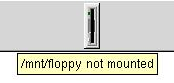
The mount point and mount status of a drive is shown in a tooltip if the cursor is left over the applet for a short time, as shown in Figure 66.
Customization
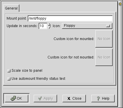
You can customize Drive Mount applet by right-clicking on it and choosing Properties…. This will open the Properties dialog(shown in Figure 67), which allows you to change various settings.
The properties are:
Mount Point — This is the mount point used when mounting the drive. This is an empty directory which will hold the contents of the drive whenever the drive is mounted. Mount points can occur anywhere in your filesystem, but the convention is to put all mount points for removable drives in the /mnt directory.
Update in seconds — This is the interval in seconds at which Drive Mount refreshes its icon by checking the mount status. This is only important if you sometimes mount or unmount a drive using a command or application other than Drive Mount.
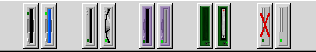
Icon — This determines the icons (one for unmounted and one for mounted) displayed for the drive. There are icon sets for most of the commonly used drives (floppy, CDROM, Zip, hard disk, and JAZ). They are shown in Figure 68. You may also select Custom; this allows you to specify your own icons.
Notice that Figure 68 shows the icons for the unmounted and mounted states of (from left to right) floppy, CDROM, Zip, JAZ, and hard disk drives.
Custom icon for mounted — A custom icon which is displayed when the drive is mounted. This option is only available if the Icon: selection is set to "Custom".
Custom icon for not mounted — A custom icon which is displayed when the drive is not mounted. This option is only available if the Icon: selection is set to "Custom".
Scale size to panel — Selecting this option scales the size of the mounted and unmounted icons with the Panel's size. If this option is not set, the icon sizes are fixed, independent of the size of the Panel. Selecting this option typically makes for a nicer appearance. For very small Panel sizes, unselecting this option may be useful, as it forces the applet to appear rotated and larger, which makes it easier to see.
Use automount friendly status test — Select this option if you use automount, otherwise leave it unselected.
Information for Advanced Users The default command used by Drive Mountto test whether a drive is mounted is stat and would cause the drive to actually be mounted if the user is using automount. If this button is selected, it uses mount instead, which does not cause automount to mount the drive. The reason this button is not selected by default is that mount is more cpu intensive than stat.
After you have made all the changes you want, click on OK to apply the changes and close the Properties dialog. Click Apply to apply changes without closing. Close closes Properties without saving changes which have not been applied. Applied changes cannot be cancelled.
Configuring Your System
 | For Advanced Users |
|---|---|
This section is intended for system administrators and advanced users. |
In order for Drive Mount Applet to work properly, the system may need to be configured by the system administrator, using root privileges. This section provides a very basic introduction.
Information describing the mount point and filesystem type of each drive is kept in /etc/fstab. This can be configured by hand or by using the linuxconf application. For drives which do not always have a single filesystem type (such as a floppy drive which may have msdos or ext2 filesystems), you should use "auto" for the filesystem type. Each device has a single line in /etc/fstab of the following form:
/dev/fd0 /mnt/floppy auto noauto,rw,user 0 0
|
The linuxconf application provides a graphical interface for controlling these filesystems. To start linuxconf, just type linuxconf in a shell window (you must log in as root). Select Config->filesystems->Access local drive. To edit an entry, just select it. linuxconf is meant to be easy to use and has its own internal help system to guide you through the process. You may also add new entries by selecting the Add button.
Troubleshooting and Understanding Error Messages
If you do not have your system configured properly, you may encounter certain error messages when trying to mount or access certain drives. Here are some of the more common error messages and their causes:
"mount: /dev/fd0 is not a valid block device"— The most common cause for this error is that the drive (in this example, /dev/fd0, corresponding to the floppy drive) is empty.
"mount: only root can mount /dev/fda on /mnt/floppy"— You do not have permission to mount this drive. Contact the system administrator, who can give you permission.
Note for System Administrators You can set a drive to be mountable and unmountable by users by adding "users" to the mount options (fourth column) in /etc/fstab. This may be done by hand or by using linuxconf, using the Local volume tab in Config->Filesystems->Access local drive. After you select the correct drive from the list, it will show you the Volume specifications. Click on the Options tab, and select the User mountable button.
"mount: wrong fs type, bad option, bad superblock on /dev/cdrom, or too many mounted file systems"— This error can be caused by several problems. It is most commonly caused by not having the right filesystem type, such as trying to mount a music CDROM as if it held data, or trying to mount an msdos formatted floppy as ext2.
"mount /mnt/cdrom 2>&1 reported: mount: No medium found"— This error indicates the drive, in this case the CDROM drive, is empty.
"umount /mnt/cdrom 2>&1 reported: umount: /mnt/cdrom: device is busy"— This error indicates that the drive cannot be unmounted because the drive is being used by the computer. This often happens if you have the GNOME File Manager open to a directory on the drive or if you have a terminal window open with the working directory on the drive.
"umount: can't find /mnt/floppy in /etc/fstab or /etc/mtab "— This indicates that the system has not been configured to mount the mount point you are trying to use. In many cases, you may have put the wrong mount point in the Mount point entry in the Properties Dialog (see the section called Customization). To find out which mount point you should be using, contact your system administrator.
Note for Advanced Users Each device (filesystem or drive) which can be mounted should be listed in the /etc/fstab configuration file. Reading this file will tell you which devices are configured for your system. To add or modify entries, you can edit this file by hand or by using the linuxconf application.
"mount: /dev/fd0 already mounted or /mnt/floppy busy mount: according to mtab, /dev/fd0 is mounted on /mnt/floppy_ext2 "— This error occurs if you have a single device (in this case /dev/fd0) configured for multiple mount points and you try to mount one mount point while another one is already mounted. Having multiple mount points for a single device typically is not necessary.
"mount: the kernel does not recognize /dev/sda4 as a block device(maybe 'insmod driver'?)"— Contact your system administrator. (This error occurs if your kernel is not properly configured to automatically mount the necessary kernel modules to read the device.)
Known Bugs and Limitations
Eject does not always work. Trying to eject with the drive mounted does not give a warning, explaining why the drive does not eject.
Authors
Drive Mount Applet was written by John Ellis (<johne@bellatlantic.net>). Please send all comments, suggestions, and bug reports to the GNOME bug tracking database. (Instructions for submitting bug reports can be found on-line. If you are using GNOME 1.1 or later, you can also use Bug Report Tool (bug-buddy), available in the Utilities submenu of Main Menu, for submitting bug reports.
This manual was written by Dan Mueth (<d-mueth@uchicago.edu>). Please send all comments and suggestions regarding this manual to the GNOME Documentation Project by sending an email to <docs@gnome.org>. You can also submit comments online by using the GNOME Documentation Status Table.
GNOME KeyBoard Applet
GNOME KeyBoard Applet, shown with its default configuration in Figure 69, allows you to easily and quickly change the keyboard map to those used in various different countries. To add this applet to a Panel, right-click on the Panel and choose Panel->Add to panel->Applet->Utility->GKB KeyBoard Switcher.

Usage
Once configured, the GNOME Keyboard applet allows you to switch the keyboard mapping between any number of keyboard layout. Just left-click on the applet or press Alt-Shift to switch the keyboard mapping.
Right-clicking on the applet brings up a menu containing the following items:
Properties… — opens the Properties dialog.
Help — displays this document.
About… — shows basic information about GNOME KeyBoard Applet, including the applet's version and the author's name.
Customization
You can customize GNOME KeyBoard applet by right-clicking on it and choosing Properties…. This will open the Properties dialog (shown in Figure 70), which allows you to add, modify, and remove keymaps, as well as to configure the applet's appearance.
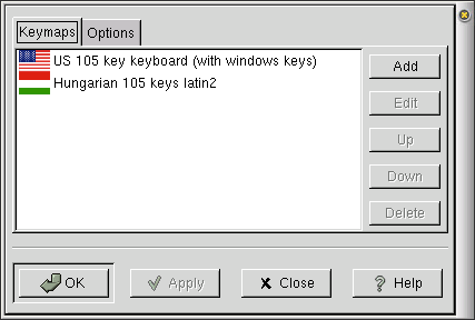
The Properties dialog box has two tabs: Keymaps and Options. On the Keymaps tab, you can Add, Edit, Delete or change the order of keyboard layouts. On the Options tab you can set the appearance of the applet (flag, label or flag+label) and its size (Normal or Big), as well as the key sequence to use to get GKB to switch between keyboard layouts (see the section called Known Bugs and Limitations).
Setting keyboard layouts for your language
Setting up keymaps can consist in one or more of the following steps:
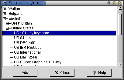
Adding a required keyboard layout — On the Keymaps tab, click on the Add button. The tree shown in Figure 71 allows you to choose the keymap best suited for you, based on the language and the country involved.
To add a keymap, click on the + sign preceeding the languge you want to set. A list of coutries where the given language is used appears. Again, click on the + preceeding the country chosen, and a list of keymaps shows up. Select the keymap you would like to use and click Add. Your keymap gets added to the list on the GKB Properties window. You may add another keymap or click Close to close the Select Layout dialog.
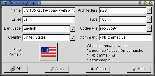
Editing an existing keyboard layout — Selecting a keymap and pressing the Edit brings up the Edit keymap window (see Figure 72).
On this dialog, you can modify different properties of the keymap. These properties are:
Name: The name of the keymap, as shown in the GKB Properties window and in the hint appearing when you move your mouse over the applet.
Label: This is the label that appears when you set "Label" or "Flag+Label" modes. See the section called Miscellaneous options for more details.
Language: This option will be used in Gnome 2.0. It has no effect right now.
Country: This option will be used in Gnome 2.0. It has no effect right now.
Flag: This is the place where you can set the flag to be displayed with the given keyboard layout.
Architecture:This option will be used in Gnome 2.0. It has no effect right now.
Type: This option will be used in Gnome 2.0. It has no effect right now.
Code page: This option will be used in Gnome 2.0. It has no effect right now.
Command: This is the command which GNOME KeyBoard will use to change the keymap. The default is to use the gkb_xmmap xmodmap-file-extension command, where xmodmap-file-extension should be replaced by the extension of the xmodmap file you want to use.

Finding keyboard layouts availble on your system On a typical Linux system, xmodmap files can be found under the directory /usr/share/xmodmap.
To set the keymap to a US 101 key keyboard, for example, you would use gkb_xmmap us-101.
If this doesn't work, you may also try setting the keyboard using command setxkbmap LC where LC is the two letter country code of your locale. (for example, setxkbmap fr to use a French keyboard). Finally, if you have your own keyboard layout (xmodmap) file, set the command to xmodmap xmodmap-filename (for example, xmodmap ~/xrus/yawerty.koi8.xmm to use keyboard layout for Cyrillic letters in koi8 encoding). Please see the section called Technical information for more information.
Removing a keyboard layout that is no longer needed — To remove a keyboard, select it (click on it in the GKB Properties window) and click the Delete button.
Reordering keyboard layouts — The order in which the keyboard layouts become active as you click on the applet or press the hot key depends on the order they appear in the list in the Properties window. The layout that is displayed at the top of the list will become the default layout when you close the Properties window. To change the order in the list, select the keymap to be moved, and click Up or Down as appropriate.
After you have made all the changes you want, click on Apply to apply the changes or on OK to apply the changes and close the Properties dialog. To cancel the changes and return to previous values, click the Close button. The Help button brings up this chapter of the on-line help.
Miscellaneous options
Different options allow you to customize the look of your applet. As a new feature, you can select between three different display modes:
Flag mode — The flag associated to the keymap is displayed on the Panel.
Label mode — No flag is displayed, only the label associated with the keymap.
Flag and label mode — Both flag and label associated with the keymap are displayed.
Many users have reported, that the applet takes too much room on the panel. You can now set the applets size from the Applet size pull down list. Set the size to Normal if you want a smaller applet. If you have plenty of space or like nice big flags on you panel, set the option to Big.
An often formulated user wish was to implement the keymap switching using hotkeys. The developers proudly announce, that keyboard initiated switching now works. The hotkey combination that allows to change keymaps is set to Alt-Shift (Alt being the left Alt key). You can customize this hotkey sequence from the GKB Properties window's Options tab. Click on the Grab hotkey button and press the keys you want to set. The key combination is displayed in the input box near the button (you may see something like: Control-Shift_R). Finally, click on Apply or OK to finalize the new settings.
Technical information
Normally you do not need these details - but if something is not working, or you are just curious, read on.
GNOME Keyboard switches the keyboard map by issuing a command to X Window System. X Window System has two mechanisms for setting keyboard mapping: older one called "xmodmap" and a newer one, based on the so-called "Xkb extension". If you have Xkb enabled, you should use it and switch keyboard layouts by issuing a command setxkbmap LC. It comes with a number of various keyboard layout files, usually in directory /usr/X11R6/lib/X11/xkb/symbols.
If you do not have Xkb extension enabled, or if it just does not cover the language you need, you should use the older xmodmap mechanism. In this case, you need to have a file which describes keyboard layout in a special format (see manual page for xmodmap for details), and the command should be xmodmap filename . GNOME Keyboard includes a number of keyboard layout files, which are installed in the directory /usr/share/xmodmap; these files have names like xmodmap.de. To use one of these files, you can use the command gkb_xmmap LC which is equivalent to xmodmap /usr/share/xmodmap/xmodmap.LC: for example, gkb_xmmap hu is the same as xmodmap /usr/share/xmodmap/xmodmap.hu.
Known Bugs and Limitations
Languages and countries showing up in the Select layout dialog are not sorted in alphabetical order.
The program has very few error handling routines implemented. If you try to feed it something unusual, it may crash.
If it does not crash, it returns the error: "The keymap switching returned an error". If the Edit window is open when this error appears and you press the OK button on this window, it is likely that nothing will happen. Try closing the Edit window first and then the error window.
Authors
GNOME KeyBoard was written by Szabolcs Ban (<shooby@gnome.hu>). Please send all comments, suggestions, and bug reports to the GNOME bug tracking database. (Instructions for submitting bug reports can be found on-line). You can also use Bug Report Tool (bug-buddy), available in the Utilities submenu of Main Menu, for submitting bug reports.
This manual was originally written by Szabolcs (Shooby) Ban (<shooby@gnome.hu>) and Dan Mueth (<d-mueth@uchicago.edu>). It has been rewritten (strongly based on the original) by Emese Kovacs (<emese@gnome.hu>) to reflect changes from v1.2 to v1.4. The Technical Information section has been added by Alexander Kirillov (<kirillov@math.sunysb.edu>). Please send all comments and suggestions regarding this manual to the GNOME Documentation Project by sending an email to <docs@gnome.org>. You can also submit comments online by using the GNOME Documentation Status Table.
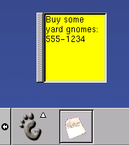
GNOTES! Applet
GNOTES! applet, shown in Figure 73, allows you to cover your GNOME desktop with little, yellow, virtual sticky-notes. To learn how to add this applet to a Panel, right-click on the Panel and choose Panel->Add to panel->Applet->Utility->GNotes!.
Usage
This applet places a yellow sticky-note on your desktop. To use it, left-click on the GNOTES! icon to make a new note appear on your desktop. After creating a new note, you may then left-click within the yellow area of the note to begin adding text to it.
Right-Click Pop-Up Menu Items
In addition to the standard menu items, the right-click pop-up menu has the following items:
Properties… — opens the Properties dialog which allows you to customize the appearance and behavior of this applet.
Help — displays this document.
About… — shows basic information about APPLET Applet, inluding the applet's version and the author's name.
Raise Notes — causes all your notes to appear above any overlapping windows.
Lower Notes — causes all your notes to be hidden below any overlapping windows.
Hide Notes — causes all your notes to become hidden from view. It does not destroy your notes.
Show Notes — brings your notes back into view if you used the Hide Notes menu command.
Right-Clicking on the Left Border of Individual Notes
You may also right-click on the left border of each of the notes on your desktop to change their individual properties.
Raise Note — This menu item causes your note to appear above any overlapping windows.
Lower Note — This menu item causes your note to be placed below any overlapping windows.
Hide Note — This menu item causes your note to become hidden from view. It does not destroy your note.
Destroy Note — This menu item permanently removes your note from the desktop. Unlike Hide Notes, you may not recover your note.
Properties
You can configure GNOTES! applet by right-clicking on the applet and choosing the Properties... menu item. This will open the Properties dialog, shown in Figure 2.
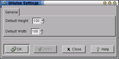
To change the default size at which your notes appear on the desktop, you may either click on the up and down arrows, or type values (in pixels) directly into the fields next to the Default Height and Default Width labels.
After you have made all the changes you want, click on OK to apply the changes and close the Properties dialog. To cancel the changes and return to previous values, click the Cancel button.
Known Bugs and Limitations
Setting the Default Height or Default Width may cause the GNOTES to crash.
After first adding GNOTES! to your Panel, clicking on the first note you create may cause a second note to be created on your desktop.
Authors
This applet was writen by spoon <spoon@ix.netcom.com> and dres <dres@debian.org>. Please send all comments, suggestions, and bug reports to the GNOME bug tracking database. (Instructions for submitting bug reports can be found on-line. If you are using GNOME 1.1 or later, you can also use Bug Report Tool (bug-buddy), available in the Utilities submenu of Main Menu, for submitting bug reports.
The documentation for this applet which you are reading now was written by Michael Hall <mphall@cstone.net>. Please send all comments and suggestions regarding this manual to the GNOME Documentation Project by sending an email to <docs@gnome.org>. You can also submit comments online by using the GNOME Documentation Status Table.
GNOME Weather Applet
GNOME Weather applet, shown in Figure 75, retrieves and displays various weather information. To add this applet to a Panel, right-click on the Panel and choose Panel->Add to panel->Applet->Utility->GNOME Weather.

Usage
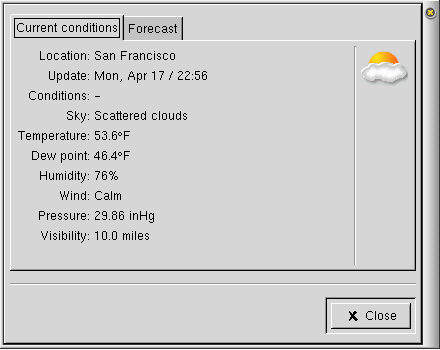
GNOME Weather displays the current temperature and weather conditions in numeric and iconified form inside the applet. For further information, double-click on the applet. This will open up the Weather Information Window, shown in Figure 76. This displays the current weather information and either a one-day or five-day forecast.
Right-clicking on the applet brings up a menu containing the following items:
Update — refreshes the weather information and display.
Properties… — opens the Properties dialog.
Help — displays this document.
About… — shows basic information about GNOME Weather Applet, inluding the applet's version and the author's name.
Customization
You can customize GNOME Weather applet by right-clicking on it and choosing Properties…. This will open the Properties dialog(shown in Figure 77), which allows you to change various settings.
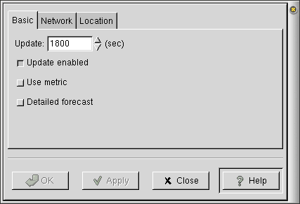
The properties in the Basic tab are:
Update Interval — This option determines how often GNOME Weather will connect to the server(s) and retrieve weather information. Current conditions, forecast and radar map (if enabled) will be downloaded
Note About Server Updates Note that the Update Interval only determines how often your computer downloads information from the server(s). The update time shown in the Current Conditions tab (viewed by double-clicking on the applet) indicates when those measurements were renewed on the server, rather than when they were last retrieved.
Disabling Automatic Updates and Using Manual Updates You can disable automatic updates by unchecking the Update enabled box. On the other hand, you can also force GNOME Weather to perform an update by choosing the corresponding option in the popup menu. These two options are very useful if you have an intermitant internet connection, such as a laptop or modem provides.
Update enabled — Select this if you would like GNOME Weather to automatically download the latest weather information at the time interval specified by Update. Deselect this if you would only like weather updates to be done manually, by right-clicking on the applet and selecting Update.
Use metric — By default GNOME Weather uses the imperial system of units. Select this box to use metric units. The units used are shown in Table 1.
Detailed Forecast — Select this if you would like GNOME Weather to retrieve the full five day forecast for your particular area. Note that these forecasts may not be available for some locations.
The forecast retrieved when this button is not selected is a brief forecast for the broader area containing the selected location (usually the entire state) and typically is a 5-day forecast.
Forecast Availability Note that the detailed forecasts downloaded from IWIN are available only for US cities.
The properties in the Network tab should be used if your computer is located behind a firewall. These properties are:
Use proxy — Select this button if your computer is behind a firewall and you must use an HTTP proxy to access the Web.
Proxy host — Enter your proxy host IP address here (if you are using a HTTP proxy).
Username — Enter your username here.
Password — Enter your password here. (Note that this password will be saved in a private configuration file but will not be encrypted.)
The Location tab allows you to specify the geographic location that you would like GNOME Weather applet to display the weather information for. Click on any plus (+) symbol to expand the tree or any minus (-) symbol to collapse a tree branch. Select the city or region by clicking with the first mouse button.
Locations are organized in a three-level hierarchy. The top level contains broader geographical areas, the second contains sub-regions of these areas and the last contains the particular locations. This hierarchy is essentially based on the way information is organized in the US NWS (National Weather Service), and that is the reason that the US and Canada appear on the topmost level.
After you have made all the changes you want, click on OK to apply the changes and close the Properties dialog. To cancel the changes and return to previous values, click the Cancel button.
Further Information
GNOME Weather has a homepage at http://gweather.dhs.org/. Here you can find the latest Locations file, which is periodically updated with new cities, as sent in by users. If your city is not included in the distribution, please send an email to Spiros Papadimitriou (<spapadim+@cs.cmu.edu>) with the necessary information and it will be included in the next release.
You may also want to visit the homepage if you are curious to see what's new.
Known Bugs and Limitations
Blocking Input/Output
Even though GNOME Weather now uses non-blocking I/O to retrieve data from the network, there are still some steps that block execution. Most notably, establishing a TCP connection to remote hosts is a blocking operation. Because the NWS and IWIN web servers are often heavily loaded, this step may take a significant amount of time. While that happens, the application is unable to respond to CORBA requests from the Panel. In its current implementation, the Panel iterates through all applications and sends frequent CORBA requests (eg. for saving state). If an applet cannot respond for any reason, then the Panel will block waiting for a response.
While the Panel is blocked, it will not respond to any user (or application) requests. For instance, Panel movement and Panel menus (the ones that appear upon a right click) will not work. However, other applets in the Panel should work (unless they have made a CORBA request to the Panel, eg. for querying Panel size). As soon as the blocking operation in GNOME Weather completes, things should return to normal (and user interface requests that were buffered will be executed).
There is an experimental version of GNOME Weather that uses a separate thread for HTTP processing, which may be incorporated (temporarily) in the next release. However, the final solution is gnome-vfs which will be part of GNOME 2.0 and will offer cross-platform support for fully asynchronous I/O.
Frequently Asked Questions
This is a list of frequently asked questions about GNOME Weather. For further information and updates, please visit the GNOME Weather homepage. If your question is still unresolved, you can email the author at <spapadim+gweather@cs.cmu.edu>.
Why does GNOME Weather freezes my Panel?
This is due to the blocking nature of certain network operations (see also the section called Blocking Input/Output) and due to the way the Panel currently works.
Why does location list appears empty?
This is probably because the Locations file was not installed in the proper place. This is usually because GNOME Weather and GNOME were not configured in the same way. The file containing the locations must be installed in the gweather subdirectory, under the gnome data directory. You can find out the latter with the gnome-config --datadir command.
If you have compiled gnome-applets yourself, make sure that you have used configure --prefix=`gnome-config --prefix` --sysconfdir=`gnome-config --sysconfdir`. Binary RPMs assume a that the prefix and sysconfdir are /usr and /etc, respectively. If you have compiled GNOME yourself with different options, you need to download and compile gnome-applets yourself.
Why does GNOME Weather display a question mark and dashes for current conditions?
This will happen if GNOME Weather cannot access the NWS server for any reason. This may be because your network connection is down, or the NWS server is down, or maybe the NWS server does not currently have any information about your location.
Why does GNOME Weather say that a forecast is not available?
If you have enabled detailed forecasts, then it is possible that one may not be available for your location. In this case, try disabling detailed forecasts.
Another possible reason is that the IWIN server is down and GNOME Weather cannot retrieve forecast information. The problem should go away as soon as the IWIN server is up again.
Authors
GNOME Weather was written by Spiros Papadimitriou (<spapadim+@cs.cmu.edu>). Please send all comments, suggestions, and bug reports to the GNOME bug tracking database. (Instructions for submitting bug reports can be found on-line. If you are using GNOME 1.1 or later, you can also use Bug Report Tool (bug-buddy), available in the Utilities submenu of Main Menu, for submitting bug reports.
This manual was written by Spiros Papadimitriou (<spapadim+@cs.cmu.edu>) and Dan Mueth (<d-mueth@uchicago.edu>). Please send all comments and suggestions regarding this manual to the GNOME Documentation Project by sending an email to <docs@gnome.org>. You can also submit comments online by using the GNOME Documentation Status Table.
Mini-Commander Applet
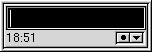
Mini-Commander applet, shown in Figure 78, adds a command line to your Panel. It features command completion, command history, changeable macros and an optional built-in clock. Because of the changeable macros you can use it for many different tasks. You can simply start a program (or a short macro) or view a web page or search for a man/info page etc. Mini-Commander can be detached from your Panel using an optional handler on the side, which is especially usefull for people who use vertical panels.
To add this applet to a Panel, right-click on the Panel and choose Panel->Add to panel->Applet->Utility->Mini-Commander.
Usage
To start a program or run a command, simply enter the program or command and press return. Or, to browse for an application or command in your filesystem, click on the small circle in the lower corner.
Mini-Commander has command completion (similar to many other user shells). Thus, you often have not to enter the full name but only the first few characters followed by the tab key. Mini-Commander will try to complete the program name in the same way most UNIX shells do.
Mini-Commander also has command history, which allows you to recall previous commands by pressing the arrow-up or arrow-down key. This works like the command history in most UNIX shells. Note that commands are not stored in the history if it is already present in the history in order to avoid duplication. You may also access the history list by pressing the small down arrow icon in the applet and selecting a command from the history list.
Mini-Commander has the ability to use macros. It has some predefined macros. For example if you enter term:command then command is executed in a terminal window. Or if you enter an URL then your web browser is used to view it. Additionally you can define your own macros or change the predefined ones.
Right-clicking on the applet brings up a menu containing the following items:
Properties… — opens the Properties dialog.
Help — displays this document.
About… — shows basic information about Mini-commander Applet, including the applet's version and the author's name.
Customization
You can customize Mini-Commander applet by right-clicking on it and choosing Properties…. This will open the Properties dialog(shown in Figure 79), which allows you to change various settings.
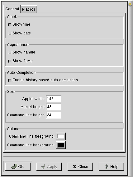
The properties in the General tab are:
Show time — If this button is checked, the time will be shown in the lower corner of the applet.
Show date — If this button is checked, the date will be shown in the lower corner of the applet.
Show handle — If this button is checked, a handle will be attached to the edge of the applet, allowing you to detach the applet from the Panel. You may re-attach the applet on the Panel by dragging it back into place.
Show frame — If this button is checked, a thin black frame will be drawn around the applet.
Enable history based auto completion — If this button is selected, Mini-Commander will automatically complete commands using the history list.
Applet width — Enter the desired applet width here.
Applet height — Enter the desired applet height here.
Command line height — (This feature is disabled.)
Command line foreground — Select the foreground color, used for the text you enter.
Command line background — Selecting the background color, used for the background behind the text in the entry.
The Macros tab consists of a list of up to 99 macros, each of which is a regular expression (Regex) and a macro (Macro). Enter the regular expression for Mini-Commander to match in the left column, and the corresponding macro which should be executed in the right column. The default setting has many useful macros already defined, which may be helpful in learning to write your own macros.
After you have made all the changes you want, click on OK to apply the changes and close the Properties dialog. To cancel the changes and return to previous values, click the Close button.
Frequently Asked Questions
Here are listed some frequently asked questions and the answers to them.
This is a confusing problem which seems to have several reasons and which occurs only under certain conditions.
If you cannot give Mini-Commander applet keyboard focus at all then this could be a problem with you window manager. If this is true for you it would helpful if you write me a short mail and tell me what window manager you are using (name and version).
Sometimes it happens that you can give keyboard focus to Mini-Commander applet only for the first time. After this it is impossible to focus it again. Currently the reason for this bug is unknown.
Known Bugs and Limitations
In some instances, it is impossible to give Mini-Commander focus after the first time.
Further Information
For more information on Mini-Commander applet, check out its web page at http://www.maruhn.com/mini-commander/.
Authors
Mini-Commander was written by Oliver Maruhn (<oliver@maruhn.com>). Please send all comments, suggestions, and bug reports to the GNOME bug tracking database. (Instructions for submitting bug reports can be found on-line. If you are using GNOME 1.1 or later, you can also use Bug Report Tool (bug-buddy), available in the Utilities submenu of Main Menu, for submitting bug reports.
This manual was written by Oliver Maruhn (<oliver@maruhn.com>). Minor modifications and updates were made by Dan Mueth (<d-mueth@uchicago.edu>). Please send all comments and suggestions regarding this manual to the GNOME Documentation Project by sending an email to <docs@gnome.org>. You can also submit comments online by using the GNOME Documentation Status Table.
Printer Applet
Printer applet, shown in Figure 80, allows you to print files by dragging them onto the applet from the desktop or file manager. To add this applet to a Panel, right-click on the Panel and choose Panel->Add to panel->Applet->Utility->Printer Applet.

Usage
To print a file from your desktop or file manager, drag the file onto the printer applet.
Right-Click Pop-Up Menu Items
Right-clicking on the applet brings up a menu containing the following items:
Properties... — This menu item opens the Properties dialog (see the section called Properties) which allows you to customize the appearance and behavior of this applet.
Help — displays this document.
About… — shows basic information about the Printer Applet, including the applet's version and the author's name.
Properties
You can configure printer applet by right-clicking on the applet and choosing the Properties... menu item. This will open the Properties dialog, shown in Figure 81.
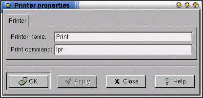
To change the label displayed at the bottom of the printer applet, ("Print" in Figure 80 in the section called Printer Applet) type a new name in the Printer name field. This setting is useful if you have more than one printer available for use and wish to add a printer applet to the Panel for each printer. The Printer name does not determine which printer your file will be printed to, it exists as an easy means to to distinguish between printers should you have more than one printer applet installed on your Panel.
To change the command the printer applet uses to print your files, you may enter a new command in the Print command field. By default, the printer applet uses the command lpr, which is common to many systems. Your system may use a different command. If you're unsure, check your system's documentation.
| Note for advanced users |
|---|---|
If you have more than one printer, you may designate which printer to send files to by changing the Print command setting. For instance, if your system uses the command lpr to print files and you need to print your file on the printer named "ljet5", you would change the Print command setting to lpr -Pljet5. |
After you have made all the changes you want, click on OK to apply the changes and close the Properties dialog. To cancel the changes and return to previous values, click the Close button.
Known Bugs and Limitations
There are no known bugs in the printer applet.
Authors
Printer Applet was written by Miguel de Icaza (<miguel@kernel.org>) and Federico Mena (<quartic@gimp.org>). Please send all comments, suggestions, and bug reports to the GNOME bug tracking database. (Instructions for submitting bug reports can be found on-line. You also can use Bug Report Tool (bug-buddy), available in the Utilities submenu of Main Menu, for submitting bug reports.
This manual was written by Michael Hall (<mphall@cstone.net>). Please send all comments and suggestions regarding this manual to the GNOME Documentation Project by sending an email to <docs@gnome.org>. You can also submit comments online by using the GNOME Documentation Status Table.
QuickLaunch Applet
QuickLaunch is an applet which holds application launchers. It shrinks the launcher icons to their smallest size to save room on your panel. The example QuickLaunch Applet shown in Figure 82 contains eight GNOME application launchers in a standard-sized Panel. To add this applet to a Panel, right-click on the Panel and choose Panel->Add to panel->Applet->Utility->QuickLaunch.
Usage
To add a launcher to the QuickLaunch applet, just drag it from its current position (either on a Panel or in the Main Menu) onto the QuickLaunch applet using the left mouse button. To remove a launcher from the QuickLaunch applet, just right-click on the launcher and select Delete launcher. To configure the properties of a launcher which is in your QuickLaunch applet, right-click on the launcher and select Launcher Properties….
The vertical bar at the left edge of the applet is used for easily moving the applet in your Panel. Grab the applet by depressing the left or center mouse button and then move the applet, releasing the mouse button when finished. This vertical bar is also used to access the applet menu items by right-clicking on this bar.
Right-clicking on the vertical bar on the left side of the applet brings up a menu containing the following items:
Help — displays this document.
About… — shows basic information about APPLET Applet, inluding the applet's version and the author's name.
Known Bugs and Limitations
It is not possible to re-arrange launchers inside the QuickLaunch applet. It is also not possible to have multiple QuickLaunch applets with different contents.
Authors
QuickLaunch applet was written by Fabio Gomes de Souza (<fabiofb@altavista.net>). Please send all comments, suggestions, and bug reports to the GNOME bug tracking database. (Instructions for submitting bug reports can be found on-line. If you are using GNOME 1.1 or later, you can also use Bug Report Tool (bug-buddy), available in the Utilities submenu of Main Menu, for submitting bug reports.
This manual was written by Dan Mueth (<d-mueth@uchicago.edu>). Please send all comments and suggestions regarding this manual to the GNOME Documentation Project by sending an email to <docs@gnome.org>. You can also submit comments online by using the GNOME Documentation Status Table.
ScreenShooter Applet
Screen-Shooter is a handy little screengrabber which is simple to use. It sits in your panel and you can click on it to take a screenshot of either the whole desktop or just a single window.
To add the applet to your panel, you can right-click on an empty part of the panel and follow the sequence Applets->Utility->ScreenShooter.
Usage
To take a picture of the entire desktop, left-click on the image of a monitor. This button is the lower of the two on a normally-sized horizontal panel and the right-hand button on a narrow horizontal panel or a vertical panel.
To take a picture of just one window, left-click on the image of a window. This button is the top one on a normally-sized horizontal panel and the left-hand one on a narrow horizontal panel or a vertical panel. The button will stay pressed in and the cursor will change to a cross. Move the cursor to the window you want a picture of, and click in that window to select it.
Right-clicking on the applet brings up a menu containing the usual options for an applet, including a Properties option described below.
Settings
Screen-Shooter can be configured to do a number of different things. To configure Screen-Shooter, click on the applet with mouse button 3 (usually, right mouse button) and select Properties from the popup menu. The Preferences dialogue has seven sections described below. Five of these are visible initially: two more sections are available from a toggle in the first section.
General Preferences
- Capture WM decorations when grabbing a window
The capture decorations checkbox controls whether or not the titlebar and edges of a window are included. It is only relevant when Screen-Shooter is taking a picture of a single window rather than of the whole screen or of a rectangle you have selected. The default is for this to be checked and for the titlebar and window borders to be included in the shot.
- Give audio feedback using the keyboard bell
The audio feedback checkbox controls whether or not Screen-Shooter will beep when it actually takes the shot. The default is to beep.
- Display spurious options
The spurious options checkbox controls whether some of Screen-Shooter's more esoteric options are available. The default is off (i.e., they are not available). Checking this option makes two sections called Spurious 1 and Spurious 2 visible in the preferences dialogue.
- Delay before taking shot
When taking shots of the desktop, you can set a delay between clicking on the Screen-Shooter and the shot being taken. The delay can be up to one minute. This can be very useful when you want to focus on a particular window or if you want to bring up a menu.
- Compression quality
Compression quality does not refer to how tightly a file is compressed, but to how well it retains detail after compression. The higher the compression quality, the better the quality of the image, but the larger the size of the resulting file. It is relevant when you are saving something as a JPEG, a MIFF or a PNG file. The default compression quality is 75%.
- Create monochrome image
A fairly self-explanatory option: if this is selected, the resulting image will be in monochrome. This is off by default.
- Invert colours in image
Another self-explanatory option: if this is selected, the colours of the image are reversed so that white becomes black, pale purple becomes greenish, and so on. Lovely -- but rarely useful! Off by default.
Files, Apps
- Directory to save file in
The directory to save the shot in must exist already: Screen-Shooter will not create it for you. If you try to save it to somewhere that does not exist, then no screenshot will be taken. The default directory is ~/: your home directory.
- Filename for images
Screen-Shooter is designed to allow the user maximum flexibility in naming each shot. The filename field (as well as the directory field) is passed to a shell for normal shell expansion before being used. This allows you to use the output of programs, scripts or environment variables to name your shots. The reason for this is to allow unique filenames. By default, Screen-Shooter will create a name which is based on the time and date it was taken: this of course should always be unique. The default filename is `date +%Y_%m_%d_%H%M%S`_shot.jpg. As you can see, the filename includes the output of the date command in order to generate a datestamp. So it makes up a name based on the date, using the format the percentage symbols and letters tell it. Then it adds the rest of the name from outside the backticks to the date it has used. Explanations of the cryptic percentage symbols can be found in man date, but the arguments in the default filename are:
- %H
The hour of the day (from 00 to 23)
- %M
The minute of the hour (from 00 to 59)
- %S
The second of the minute (from 00 to 60)
- %d
The day of the month (from 01 to 31)
- %m
The month of the year (from 01 to 12)
- %y
The final two digits of the year
Other examples of filenames you might use are:
screenshot-`date +%Y%m%d-%H%M%S`.jpg
pic-`date +%H%M%S`.png
myshot.jpg
`my_own_script_to_create_a_filename`.jpg
The filename suffix determines the filetype. Screen-Shooter supports what can only be described as a ridiculous number of different image formats. Try your luck. For a full list, type man convert. You can even try .html to create a client-side image map, and wild things like that.
If your filename suffix is not something Screen-Shooter recognises, or you omit one, it will save the shot as a MIFF file. Use the convert utility to change the format later.
- View screenshot after saving
The view screenshot checkbox is unchecked by default. After checking it, you will get a view of the shot once it has been taken. You need to specify a viewer for this: the default is ee, which launches the Electric Eyes image viewing program.
Thumbnails
- Create thumbnail of image too
None of the other options on this page will have any effect if create thumbnail is not checked. By default, it is off.
- Thumbnail size
This is the percentage of the original's size that the thumbnail will be. The default is 25%.
- Thumbnail compression
This is the quality of compression to use. As with the general preferences, the better the quality of the compression, the more detail will be preserved, and the bigger the thumbnail will be. The default for a thumbnail is 50%.
- Prefix to attach to filename
This is the prefix to attach to the thumbnail filename to distinguish it from the full-sized shot. If you leave this blank, the thumbnail will overwrite the full-sized shot and you will lose the full-sized one. The default prefix is "thumb-".
- Use high-quality intermediate for generating thumbnail
The high-quality intermediate checkbox is off by default. It generates a MIFF image whilst making the thumbnail. A 'lossy' file format refers to a file format where data and detail is irretrievably lost, but which is typically much smaller than a non-lossy format image of the same thing. The typical example of a lossy file format is JPEG.
Post-Processing
| These options munch processing power compared with the options in previous sections. They work by producing an intermediate image of the screenshot, and then performing actions upon it. Once any of these options are enabled, the shot will take longer to complete, due to the extra processing involved. |
- Normalize image
The normalize image checkbox transforms the image to span the full range of colour values. Default is off.
- Equalize image
The equalize image checkbox enables histogram-based image equalization, which is a process which compensates for low contrast in an image and brings out more detail. Default is off.
- Enhance image
The enhance image checkbox tells Screen-Shooter to clean up the image as best it can, and try to remove any noise. Default is off.
- Despeckle image
The despeckle image checkbox reduces spotting by removing single pixels which are very different in colour from their surroundings. The default is off.
- Sharpen image by factor
Sharpening the image sharpens the image. The default is a factor of zero, but it can be raised to 100%.
- Rotate image clockwise
This is how many degrees clockwise to rotate the image. The default is 0: unrotated.
- Adjust gamma
The gamma checkbox enables you to adjust the gamma. The gamma value is a value to do with the intensity of the lightness of an image (and rather complicated). The range Screen-Shooter provides is from 0.8 to 2.3 with a default of 1.6. This is not a linear (straight) scale so you will need to experiment. Lowering the gamma produces a darker image. Raising it produces a lighter one.
Frills
- Create frame around image
The create frame checkbox is off by default. Checking it produces a frame around the shot taken. This frame is always grey, but Tom Gilbert notes, "if anybody requests it, I'll add options for setting its colour".
- Frame width
This determines the size of the frame in pixels. The range is from one pixel to fifty. The default frame is six pixels.
- Flip image vertically
This gives a vertical mirror image of the shot. It can be combined with the following option. The default is unchecked.
- Flip image horizontally
This gives a horizontal mirror image of the shot. It can be combined with the preceding option. The default is unchecked.
- Emboss image
Embossing an image produces an image drained of most colour and drawn in relief. The default is unchecked.
- Send image and thumbnail to...
By placing a script or program name in the box and checking the send to checkbox, you can invoke that script or program to be automatically run on the image and thumbnail. This could be used to print the image out automatically, to invoke a script to catalogue the files, or to add the pictures to a website automatically. A sample script for the latter is available with Screen-Shooter.
Spurious options: part 1
| Tom Gilbert says, "These options are all just plain silly. But they're fun. So I included them". They also munch processing power in the same manner as the post-processing options above. |
To make use of any of the options listed in this section and the next section, you need to have selected Display spurious options in the General Preferences section. They will not be available otherwise.
- Blur image
The blur image checkbox is off by default and the blur factor is set to zero. By checking the checkbox and altering the blur factor you can blur the image. Even at the highest rating (100), a typical font on a typical terminal window is still just about decipherable.
- Create charcoal effect
The charcoal checkbox is off by default and the charcoal factor is set to zero. Charcoaling produces a monochrome image with a slight smudginess which increases with the charcoal factor. It does not deal with highlighted text very well, though. The maximum factor for this is 100.
- Find edges
The find edges checkbox is off by default and the factor is set to zero. Using it produces a monochrome image where, rather than highlighting areas of different colours, it highlights the edges and borders between areas of different colour. Very interesting on maps and astronomical photos. The maximum factor for this is 100.
- Implode image
The implode image checkbox is off by default and the factor is set to zero. Using it warps the resulting screenshot as if a weight had been pressed into the centre of the shot. The maximum factor for this is 100.
Spurious options: part 2
- Create painted effect
The painted effect checkbox is off by default and the radius to paint around each pixel is set to zero. Checking it with a radius of about 5 produces an effect like an Impressionist painting. Checking it with a radius of about 50 will eat your CPU cycles like mad for ten minutes on a reasonably powerful machine. The maximum radius is 100, but you will need either a large machine or a lot of patience for that.
- Solarise image
The solarise checkbox is off by default and the factor is set to zero. Solarising is an effect first noticed in developing photographs from negatives. It results in a negative image with different colouring from that of the "inverted colours" option in the general preferences. A solarise factor of 5 will produce startling results, but the maximum factor is 100.
- Spread image pixels
The spread image checkbox is off by default and the factor is set to zero. The result of spreading the image pixels by a radius of about 5 is similar to looking through lightly frosted glass; for heavily-frosted glass, try 25. The maximum is 100.
- Swirl pixels
The swirl pixels checkbox is off by default and the factor is set to zero. Swirling the pixels results in a distorted image similar to an imploded image except that it swirls around the central point rather than stretching to it. A radius of 20 produces an effect like a fairground distorting mirror, only not a mirror-image; 90 a much increased version (although text is still legible); at 180 the entire image is warped; and at the maximum of 360 a spiral effect is created.
Known bugs and limitations
Often screenshots saved in PNG format show incorrectly in Netscape or the GNOME Help Browser. This is due to bugs in Netscape and and GNOME image libraries, not to bugs in Screen-Shooter. You can view such screenshots in a different image-viewing program; or you can try changing image compression level in the Preferences dialogue box, which sometimes helps.
Authors
The Screen-Shooter applet was written by Tom Gilbert (<gilbertt@tomgilbert.freeserve.co.uk>). Please report bugs in the Screen-Shooter applet to the GNOME bug tracking system. You can do this by following the guidelines on that site or by using bug-buddy from the command-line. For the package, put gnome-applets.
This manual was written by Telsa Gwynne (<telsa@linuxchix.org>) and Tom Gilbert (<gilbertt@tomgilbert.freeserve.co.uk>). Please send all comments and suggestions regarding this manual to the GNOME Documentation Project by sending an email to <docs@gnome.org>. You can also submit comments online by using the GNOME Documentation Status Table.
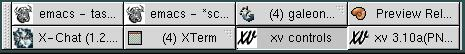
Tasklist Applet
Tasklist applet, shown in Figure 83, displays a table showing windowed applications running on your computer. Depending on the options chosen, you can display either those on the desktop currently in use, or on all virtual desktops. To add this applet to a Panel, right-click on the panel and choose Applets->Utility->Tasklist.
Usage
Tasklist allows you to quickly navigate the applications running on your computer, displaying icons and application names for each application that meets the criteria you've set in the properties window. Clicking on an icon or application name gives focus to that application, bringing it to the foreground so it accepts your keyboard input.
Right-clicking with the mouse on an application's icon or text in the applet brings up the following menu:
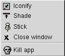
Iconify — reduce the selected application to a panel icon. When an application already has been iconified, the menu item changes to Restore. Clicking on it restores the application to your desktop.
Shade — minimize the application to a single window bar. When an application has been Shaded, the menu item changes to Unshade. Clicking on Unshade restores the application to full size.
Stick — make application "sticky", which means it remains in your field of view when you change virtual desktops, following you as you go. When an application is sticky, the menu option Unstick is displayed, allowing you to leave an application behind as you continue your virtual desktop travels.
Kill — kills the application. The properties dialog allows you to have Tasklist prompt you for confirmation before causing an application's untimely death.
Task Grouping
Tasklist can group icons together when multiple instances of a program are running. A number in parentheses appears to next to the application. Clicking on the icon brings up a menu listing all of the running instances.
Clicking on an item in the list brings that window to the foreground and gives it focus.
By default, Tasklist groups four or more applications. You can change this in the properties window.
Right-Click Pop-Up Menu Items
In addition to the standard menu items (see the section called Standard Pop-Up Items), the right-click pop-up menu has Properties... item — This menu item opens the Properties dialog (see the section called Properties) which allows you to customize the appearance and behavior of this applet.
Properties
You can configure Tasklist applet by right-clicking on the applet and choosing the Properties... menu item. This will open the Properties dialog, shown in Figure 85.
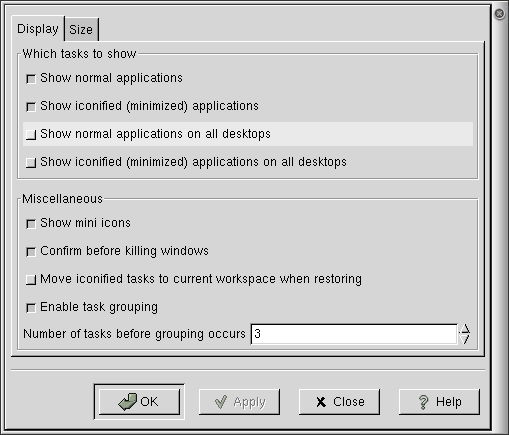
The Properties dialog allows to you control which tasks are displayed:
Show normal applications — display, in the applet, all applications on the current desktop that have not been minimized.
Show iconified (minimized) applications — show all applications on the current desktop that have been minimized
Show normal applications on all desktops — show all full-sized, non-minimized applications on all desktops. For this to work, you must also have checked the Show normal applications checkbox above.
Show iconified (minimized) applications on all desktops — show all applications that have been minimized on all desktops. For this to work, you must also have checked Show iconified (minimized) applications above.
Show mini icons — Some applications support a miniature icon. This option displays it on the Tasklist panel.
Confirm before killing windows — have the applet prompt you before you're permitted to kill an application.
Move iconified tasks to current workspace when restoring — automatically switches the desktop work area on your screen to the one containing the application you click on in the Tasklist panel.
Enable task grouping — Turns on Tasklist's grouping feature and controls the number of instances of an application that must be running before they are grouped.
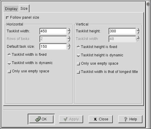
The size properties dialog controls how much space Tasklist takes up on your panel:
Follow panel size — have Tasklist size determined automatically based on panel size. This overrides other size options.
Tasklist width (height) — width (or height in vertical panel) of Tasklist in pixels.
Rows of tasks — determines how many rows of task icons Tasklist displays.
Default task size — set the default size for display of a task item. (This only has effect if Tasklist width is dynamic is checked below.)
Tasklist width (height) is fixed (dynamic) — Have the size of the tasklist fixed or established by the applet dynamically. Setting it to "fixed" means that the applet will always take the amount of space set in "tasklist width", even if there are no tasks. Setting it to dynamic means that the applet will take as much space as needed to show all tasks (zero if there are no tasks), but not more than the value set in Tasklist width.
Only use empty space — If width or height is set to be dynamic, this option forces Tasklist to use only the available space on your screen, preventing it from pushing other applets out of the way and off of your screen.
Basic Properties Options
All Properties dialogs have the following buttons at the bottom of the dialog:
OK — Pressing OK will activate any changes in the properties you have made and close the Properties dialog.
Apply — Pressing Apply at any time will make your changes active without closing the Properties dialog. This is helpful if you would like to test the effects of the changes you have made but may want to continue changing the properties.
Close — Pressing Close will close the Properties dialog. Only changes in the configuration which were previously applied with the Apply button will persist. Other changes will be discarded.
Help — Pressing Help brings up the manual for the application, opening it to the page describing the Properties dialog.
Standard Pop-Up Items
All applets should have the following items in their right-click pop-up menu:
- Remove from panel
The Remove from panel menu item removes the applet from the Panel.
- Move
After selecting Move, your mouse pointer will change appearance (typically to a cross with arrows in each direction). As you move your mouse, the applet will move with it. When you have finished moving the applet, click any mouse button and the applet will anchor in its current position. Note that applets can be moved between two Panels this way.
- Panel
The Panel submenu contains various items and submenus for adding and removing Panels and applets and for changing the configuration.
- About
The About... menu item brings up a dialogue box containing various information about the applet, typically including the applet's name, version, author, copyright, license and description.
- Help
The Help menu item brings up the help manual for the applet.
Known Bugs and Limitations
There are no known bugs in the Tasklist applet.
Authors
The Tasklist applet was written by Anders Carlsson (<andersca@gnu.org>). Please send all comments, suggestions, and bug reports to the GNOME bug tracking database. (Instructions for submitting bug reports can be found on-line. If you are using GNOME 1.1 or later, you can also use Bug Report Tool (bug-buddy), available in the Utilities submenu of Main Menu, for submitting bug reports.
This manual was written by John Fleck (<jfleck@inkstain.net>). Please send all comments and suggestions regarding this manual to the GNOME Documentation Project by sending an email to <docs@gnome.org>. You can also submit comments online by using the GNOME Documentation Status Table.
Tick-a-Stat Applet
Tick-a-Stat applet, shown in Figure 87, watches various aspects of your system and delivers information when certain events occur. For example, it can watch the CPU load and warn you when the CPU is being overloaded with concurrent processes. To add this applet to a Panel, right-click on the Panel and choose Panel->Add to panel->Applet->Utility->Tick-a-Stat.
Usage
After you have configured Tick-a-Stat, it will run continuously and does not require any input. General configuration of Tick-a-Stat is explained in the section called Customization. There are several modules which can be used. Their function and configuration is described in the section called Modules.
Right-clicking on the applet brings up a menu containing the following items:
Properties… — opens the Properties dialog.
Event Log… — opens the Event Log dialog.
Help — displays this document.
About… — shows basic information about Tick-a-Stat Applet, including the applet's version and the author's name.
Customization
You can customize Tick-a-Stat applet by right-clicking on it and choosing Properties…. This will open the Properties dialog(shown in Figure 88), which allows you to change various settings.
The Modules tab lists the various modules you can enable. Select a module from Module list on the left to configure it in the pane on the right. Each module and its configurable properties are described in the section called Modules.
The properties in the General tab are:
Enable logging of events — If this button is checked, a log of each event detected by an enabled module will be written to the file named in the Log path entry.
Log Path — This is name of the file which will be used to store the event log.
The properties in the Display tab are:
Smooth scroll — Selecting this button causes old events to slowly scroll upwards when new events occur, instead of quickly moving up to make room.
Smooth type — Selecting this button causes new text to be slowly typed across the applet as if somebody is typing it, instead of appearing very quickly.
Delay when wrapping text — This is the time delay (in tenths of a second) that it pauses when it wraps a message around the right edge of the applet (ie. for a carriage return).
Scroll speed between lines (Smooth scroll) — This is the speed at which lines are scrolled upwards.
Width — This is the width(in pixels) of the applet.
Use all room on panel — Selecting this button expands the applet along the Panel to fill all space (up to any neighboring Panel objects if they exist.)
Height — This is the height(in pixels) of the applet.
Use panel size hint — Selecting this button causes the applet to try to size itself to fit the Panel height.
After you have made all the changes you want, click on OK to apply the changes and close the Properties dialog. To cancel the changes and return to previous values, click the Cancel button.
Modules
Tick-a-Stat has several modules. Each module watches a certain part of your system and responds to different evens. Multiple modules can be run enabled at once. The standard Tick-a-Stat modules are described below.
Test Module
The Test module is a simple module that just prints "Testing line from test module :)" in the applet every few seconds.
Core Dump Catcher Module
The Dump Monitor module monitors a certain path for core dumps. If it finds one, it time stamps it and logs the backtrace. It also displays a core dump logo and message in the main applet, as shown in Figure 89 and optionally will open a dialog displaying the backtrace.
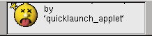
The Core Dump module settings are:
Enable this module — Selecting this button activates the module.
Show backtrace dialog on new core files — Selecting this button will cause Tick-a-Stat to open a dialog showing the backtrace each time a new core dump is found.
Path to monitor — Enter the name of the directory you would like the Core Dump module to monitor for core dumps.
Load Average Monitor Module
The Load Average Monitor module monitors the systems CPU usage and warns you when the number of processes(programs) sharing the CPU is too high. (This will cause poor performance of each process and can be indicative of an errant program or daemon.) When the CPU load is high it will display a warning, as shown in Figure 90. For even higher loads, an alert is displayed.
The Load Average Monitor module settings are:
Enable this module — Selecting this button activates the module.
Check every (Seconds) — Set this to the interval (in seconds) between checking the load.
Show pop-up dialog for this event — Select this button to have a pop-up dialog open each time a warning (or alert) is issued. (This option occurs in both the Warning and Alert sections.)
Load average threshold — Set this to the load (the average number of running programs which request use of the CPU at any instant in time). (This option occurs in both the Warning and Alert sections.)
Text to display — Enter the message which should be displayed when the load reaches the threshold level.
File Tailer Module
The File Tailer module shows any lines which are added to the end of a given file. This is typically used to monitor the output log files created by many programs.
The File Tailerr module settings are:
Enable this module — Selecting this button activates the module.
Path to tail — Set this to the name of the file you wish to tail. (The term "tail" refers to watching the tail, or end, of a file. In a shell, one can do this using the tail command, typically with the "-f" flag.)
Show pop-up dialog for new line — Select this to have a pop-up dialog showing the new line open each time a new line is added to the file.
The Event Log
The event log is used to keep track of any events which register in Tick-a-Stat. The file used for the event log and whether event logging is enabled are specified in the General tab of the Properties dialog. To view the event log, right click on the applet and select Event log….
Known Bugs and Limitations
This applet has no known bugs.
Authors
Tick-a-Stat Applet was written by John Ellis (<johne@bellatlantic.net>). Please send all comments, suggestions, and bug reports to the GNOME bug tracking database. (Instructions for submitting bug reports can be found on-line. If you are using GNOME 1.1 or later, you can also use Bug Report Tool (bug-buddy), available in the Utilities submenu of Main Menu, for submitting bug reports.
This manual was written by Dan Mueth (<d-mueth@uchicago.edu>). Please send all comments and suggestions regarding this manual to the GNOME Documentation Project by sending an email to <docs@gnome.org>. You can also submit comments online by using the GNOME Documentation Status Table.
Where Am I? Applet
The Where Am I? applet, shown in Figure 91, shows the position of your mouse pointer on the screen, reporting the coordinates as x and y, where x is horizontal and y is vertical. The dimensions of an area on the screen can be determined by dragging the cursor after the Where Am I? applet has been activated.
To add this applet to a Panel, right-click on the Panel and choose Panel->Add to panel->Applet->Utility->Where Am I?.

Usage
You don't need to do anything special to use this applet. It will report the position of your cursor as you move your mouse about. Clicking on the Where Am I? will "grab" the cursor, causing it to change to a cross-hairs shape. Once the cursor has been grabbed, you can can drag the cursor to measure the dimensions of an area on the screen. A second click will ungrab the cursor, and restore normal operation.
Right-clicking on the applet brings up a menu containing the following items:
Help — displays this document.
About… — shows basic information about Where Am I? Applet, inluding the applet's version and the author's name.
Known Bugs and Limitations
This applet has no known bugs.
Authors
Where Am I? was written by John Kodis (<kodis@jagunet.com>). Please send all comments, suggestions, and bug reports to the GNOME bug tracking database. (Instructions for submitting bug reports can be found on-line. If you are using GNOME 1.1 or later, you can also use Bug Report Tool (bug-buddy), available in the Utilities submenu of Main Menu, for submitting bug reports.
This manual was written by Telsa Gwynne (<hobbit@aloss.ukuu.org.uk>). Please send all comments and suggestions regarding this manual to the GNOME Documentation Project by sending an email to <docs@gnome.org>. You can also submit comments online by using the GNOME Documentation Status Table.
| <<< Previous | Home | Next >>> |
| Network Applets | Up | Clock Applets |